HOT
22bulbjungle
No Result
View All Result
22bulbjungle
No Result
View All Result
Home Web Development CSS

How to Create a CSS Glow Effect on Hover

in CSS, Web Development
Reading Time: 3 mins read
2k 20
0
css glow effect
2.8k
SHARES
12.7k
VIEWS
Share on FacebookShare on Twitter

The CSS Glow Effect on hover can be done by using the box-shadow styles. We also have to add transition property to the element.

Step number 1. Let’s create an anchor tag element

<a href="#">glow</a>

Step 2: Add background color and other styles

In our anchor tag, let’s add a background color and change default styles.

RelatedPosts

How To Create a Beating Heart Shape Animation Using CSS

How To Transition a Height of Zero to a Height of Auto?

How To Apply CSS to Half of a Character

I’m going to remove the text-decoration. Add a padding of 15px into top and bottom and 25px for left and right side.

I also add values for fonts, just look into the code below:

a{
background-color: orange;
text-decoration:none;
padding: 15px 25px;
font-family: sans-serif;
font-size: 25px;
color: #fff;
border-radius:10px;
display: inline-block;
}


Read also:

  • Background Image Color Overlay | Create a Filter Look with CSS
  • CSS Hover Effects | Fade in Text with Background

Step 3: Add another selector for hover state

Create another anchor tag selector with :hover state. It should look like this:

a:hover{

}


Step 4. Add the box-shadow styles.

Here is where the magic happens.

Let’s add the box-shadow styles.

We can manually create it on CSS or we can also use the CSS box-shadow generator.

Box-shadow in CSS is the same with text-shadow value parameters. You can view a tutorial on CSS shadow in this video.

In this tutorial, I’m going to use the box-shadow generator.

Get this cool CSS hover effects collection here.

Step 5. Set the Blur Radius.

css shadow generator

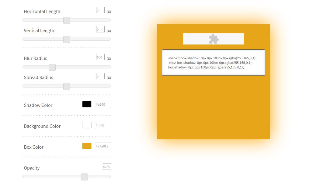
From there, you will have to set the Horizontal Length and Vertical Length into zero to ensure that the glow would be the same on both sides of the element.

It is important to have a higher blur radius. This would create the CSS glowing effect. I set this into 100.

Set the Shadow color. I will set the color the same background color with my element.

Leave the other options and copy the code you see on the right.

Step 6. Add the box-shadow styles

That’s it, add these styles to the :hover element.

a:hover{
-webkit-box-shadow: 0px 0px 100px 0px rgba(255,165,0,1);
-moz-box-shadow: 0px 0px 100px 0px rgba(255,165,0,1);
box-shadow: 0px 0px 100px 0px rgba(255,165,0,1);
}

If you try to hover over our element you will see that our shadow has been applied but we don’t like to make it appear real quick.

We will add a delay into the :hover state with our element so it’ll appear as if it was glowing.

I’m going to add transition: .8s ease.

Notice after you add and hover into the anchor tag, the element shows the box-shadow slowly thanks to our transition property.

But it disappears really quick when we unhover?

Simple…

Just add another transition property with value into the anchor tag.

The final CSS code should look like this:

a{
background-color: orange;
text-decoration:none;
padding: 15px 25px;
font-family: sans-serif;
font-size: 25px;
color: #fff;
border-radius:10px;
display: inline-block;
transition: .8s ease
}
a:hover{
-webkit-box-shadow: 0px 0px 100px 0px rgba(255,165,0,1);
-moz-box-shadow: 0px 0px 100px 0px rgba(255,165,0,1);
box-shadow: 0px 0px 100px 0px rgba(255,165,0,1);
transition: .8s ease;
}
Tags: CSSCSS Hover Effect
Share1118Tweet699Share279

Related Posts

How To Create a Beating Heart Shape Animation Using CSS
CSS

How To Create a Beating Heart Shape Animation Using CSS

by 22bulbjungle
December 28, 2022
0

Create the HTML structure Create the HTML structure for the heart shape. We'll use a div element with the class "heart": <div...

Read more
How to transition a height of zero to a height of Auto

How To Transition a Height of Zero to a Height of Auto?

December 23, 2022
How To Apply CSS to Half of a Character

How To Apply CSS to Half of a Character

December 23, 2022
How To Set Cellpadding and Cellspacing Using CSS

How To Set Cellpadding and Cellspacing Using CSS

December 22, 2022
Electronics, Smartphone, Computer & Tablet Repair Kit
How To Create a Beating Heart Shape Animation Using CSS

How To Create a Beating Heart Shape Animation Using CSS

December 28, 2022
How to transition a height of zero to a height of Auto

How To Transition a Height of Zero to a Height of Auto?

December 23, 2022
How To Apply CSS to Half of a Character

How To Apply CSS to Half of a Character

December 23, 2022
How To Set Cellpadding and Cellspacing Using CSS

How To Set Cellpadding and Cellspacing Using CSS

December 22, 2022
How To Prevent or Disable Copy and Paste in an Input Field

How To Prevent or Disable Copy and Paste in an Input Field

December 21, 2022
How To Turn Image Into Vintage With CSS

How To Turn Image Into Vintage With CSS

December 21, 2022

Free Do it yourself tutorials on CSS, HTML, Photoshop, Wordpress, and Woocommerce to help you learn web development and graphic design.

Follow Us

Affiliate Disclosure: 22bulbjungle is a participant in the Amazon Services LLC Associates Program, an affiliate advertising program designed to provide a means for sites to earn advertising fees by advertising and linking to Amazon.com.

Recent Tutorials

How To Create a Beating Heart Shape Animation Using CSS

How To Create a Beating Heart Shape Animation Using CSS

December 28, 2022
How to transition a height of zero to a height of Auto

How To Transition a Height of Zero to a Height of Auto?

December 23, 2022

Categories

  • CSS
  • Duda Builder
  • Ecommerce
  • Elementor
  • Graphic Design
  • htaccess
  • Javascript
  • jQuery
  • PC Tips
  • Photoshop
  • PHP
  • Responsive design
  • Shopify
  • Video
  • Web Design
  • Web Development
  • Webdev Tips
  • Woocommerce
  • Wordpress
  • Home
  • Blog
  • Web Development
  • Graphic Design

© 2022 22BulbJungle.

No Result
View All Result
  • Home
  • Blog
  • Web Development
    • CSS
    • Javascript
    • WordPress
  • Graphic Design
    • Photoshop

© 2022 22BulbJungle.

Welcome Back!

Login to your account below

Forgotten Password?

Retrieve your password

Please enter your username or email address to reset your password.

Log In
This website uses cookies. By continuing to use this website you are giving consent to cookies being used. Visit our Privacy and Cookie Policy.