
Instead of adding a color overlay to the background image using Photoshop, you can actually use CSS to do that.
Having the CSS to work with this, it’s easy for someone to just upload an image. The same CSS adds style to the image rather than using an image editor every time.
There are many ways you can achieve this color overlay filter effect with CSS, such as:
- Background Blend Mode (background-blend-mode property)
- Mix Blend Mode (mix-blend-mode property)
- Layering Background Image with Color
- CSS Grayscale Filter
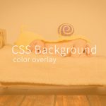
First of all, the image below is the one we are going to use in all of the methods.

Background Blend Mode (background-blend-mode property)
So, how to use background-blend-mode property?
The idea of a background blend mode is you have to add a background color and also a background image and blend it together.
Well, that was not it – you can choose the different blending modes you like.
You can also add two different images in one container and blend it together.
For example:
.container {
background-image: url("image-a.jpg"), url("image-b.jpg");
background-repeat: no-repeat, repeat;
background-blend-mode: color;
}
If you are familiar with using Photoshop, you notice that there are different blending modes option to choose from. In css, it might not actually works like every blending modes in Photoshop however most of them functions in similar way.
See video:
Here are the list of CSS Blend modes you can use:
- color
- color-burn
- color-dodge
- darken
- difference
- exclusion
- hard-light
- hue
- lighten
- luminosity
- multiply
- normal
- overlay
- saturation
- screen
- Soft-light
See example below:
.container {
width: 600px;
height: 400px;
background-image: url("image-a.jpg");
background-repeat: repeat;
background-color: red;
background-blend-mode: exclusion;
}
Result:

Note: There is a disadvantage in using this method as Internet Explorer do not support background-blend-mode property.
Mix Blend Mode (mix-blend-mode property)
Mix blend mode is the same as the background blend mode property. The only difference is mix blend mode specifies how the child element content should blend with its background.
See example below:
.container {
background-color: red;
}

.container img {
mix-blend-mode: multiply;
}
Result:

Note: Internet explorer do not support mix-blend-mode css property.
Layering Background Image with Color
Personally, I think this is the best method to use when creating a CSS background image color overlay filter effect.
See example below:
<div class="container">
<div class="content">
<h1>Please Subscribe!</h1>
</div>
</div>
.container{
width: 100%;
height: 500px;
background:url(image.jpg);
background-size: cover;
background-position: center;
display: flex;
position: relative;

}

h1{
color: #fff;
font-family: sans-serif;
text-align: center;
font-size: 60px;
}

.content{
position: absolute;
left: 0;
right: 0;
}

.container:before {
content: "";
background: #80007b;
width: 100%;
opacity: .5;
transition: .5s ease;
}

.container:hover:before{
background: #58ffd2;
}
We want to keep our :before container dimensions the same with the parent. Therefore, we add a display:flex to it
Result:

Subscribe to our youtube channel: Garnatti one!
See video:
Other example results:


CSS Grayscale Filter
Although this method only makes an image into a grayscale color, it would be easier if you use this method if you prefer a black and white image filter.
See example:
Img{
-webkit-filter: grayscale(100%);
filter: grayscale(100%);
}
Result:
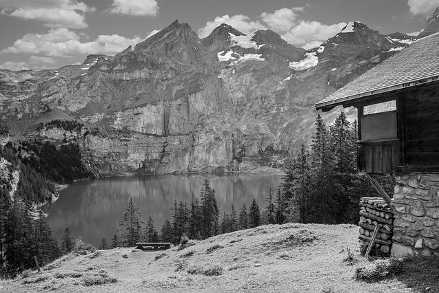
You can adjust the value percentage of the property. The higher the value the darker the image would become.
See video:
Note: Internet Explorer and Safari 5.1 and earlier do not support filter CSS property.
In conclusion, there are a lot of ways you can achieve a color filter effect to a background image using CSS. This just depends on whichever you want it.
Speaking of background image color overlay, you might also be interested in image hover effects and other background image tutorials using pure CSS.
See videos below: