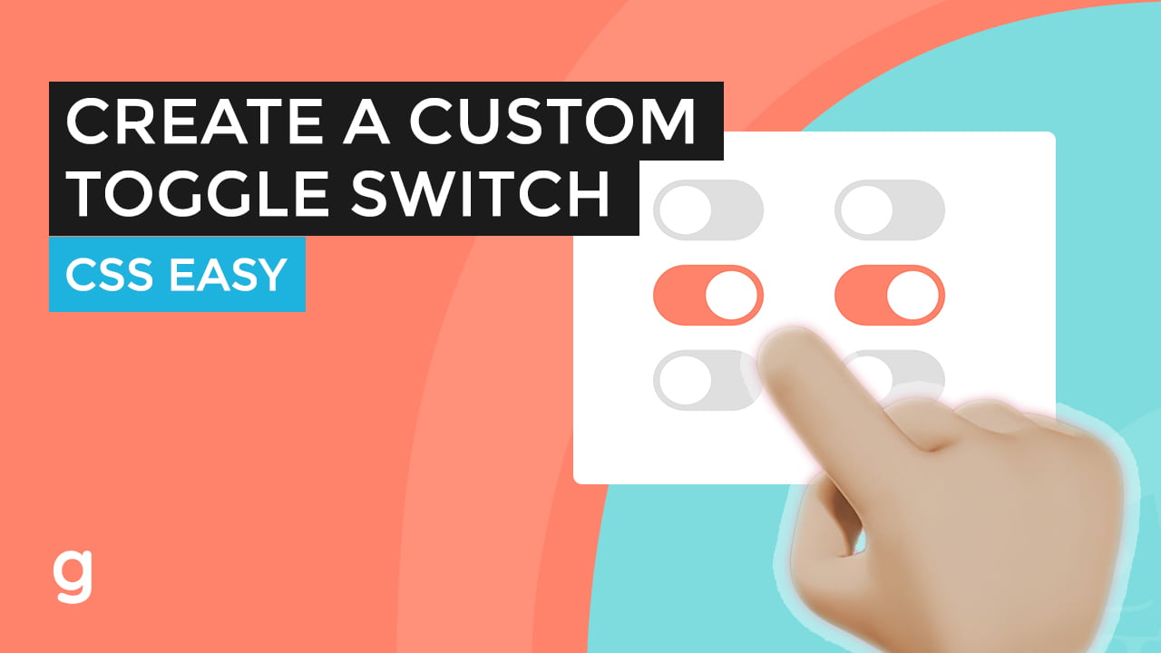
This tutorial will show you how to create a custom toggle switch using the input checkbox field and CSS.
To start, let’s create the markup.
Create a label element with a class of toggle.
Inside the element add the input checkbox type and a span element with a class of switcher.
Let’s create another two copies.
Add the checked attribute to set a default.
To style the label toggle class, add position relative.
Custom width and height.
For the switcher span element, set it to absolute.
Add a background.
Set the toggle to an “inline-block.”
Let’s hide the input element.
Set the switcher top, bottom, left, and right properties to zero.
Add border-radius.
To create the toggle round button, target the switcher pseudo-element.
set the content. Set to absolute. Add width and height. Add a background.
Set the top and left to 4 pixels. Then add a 50% “border-radius” to make it round.
Let’s make each of these toggles into a new line.
For the input-checked styling, let’s change the background of the switcher.
Also, add some shadow to the element on-focus.
Then, move the switcher pseudo element to the right when it’s checked.
And finally, add a transition to smooth it out.
The <input> element is so powerful because of its attributes; the type attribute, described with examples above, being the most important. Since every <input> element, regardless of type, is based on the HTMLInputElement interface, they technically share the exact same set of attributes. However, in reality, most attributes have an effect on only a specific subset of input types. In addition, the way some attributes impact an input depends on the input type, impacting different input types in different ways.
This section provides a table listing all the attributes with a brief description. This table is followed by a list describing each attribute in greater detail, along with which input types they are associated with. Those that are common to most or all input types are defined in greater detail below. Attributes that are unique to particular input types—or attributes which are common to all input types but have special behaviors when used on a given input type—are instead documented on those types’ pages. From: developer.mozilla.org
<label class="toggle">
  <input type="checkbox">
  <span class="switcher"></span>
</label> <br>

<label class="toggle">
  <input type="checkbox" checked>
  <span class="switcher"></span>
</label> <br>

<label class="toggle">
  <input type="checkbox">
  <span class="switcher"></span>
</label>


